Name: Dhimant Adhikari | Pythonista

Role: Data Engineer

Education: Master's in CS

Location: Midland, Texas

Email: dhimantadhikari@gmail.com

Skills

Python
Java
SQL
Pandas
NumPy
Matplotlib, Seaborn, Tableau
Scikit-Learn
PyTorch
HTML, CSS, JavaScript
React, Node.js, Express.js
Power BI, Power Query, Power Pivot
PowerApps, Power Automate
MongoDB, Firebase
Git
Streamlit

Hi there! I'm Dhimant, a Computer Science graduate student at the University of Texas Permian Basin, deeply passionate about building data-driven tools and automating real-world workflows.

During my time as an Institutional Research Analyst, I built dashboards, automated reports with SQL and Power BI, and streamlined university processes using PowerApps and Power Automate. I love turning raw data into powerful insights and real impact.

My technical toolkit includes Python, Java, and JavaScript, along with tools like React, Node.js, SQL, and MongoDB. Whether it’s crafting a neural network visualizer, simulating phishing for cybersecurity awareness, or building wardrobe apps, I enjoy the challenge of solving problems creatively.

I’ve also had the honor of serving as a Chess Club President, Student Orientation Leader, and Graduate Senator—roles that shaped my leadership, communication, and teamwork skills.

Outside of code, you’ll catch me reading, reflecting, or plotting my next idea. Let’s connect—I’m excited about opportunities where I can build meaningful things, learn constantly, and grow with awesome people.

Education

Master of Science in Computer Science

May 2025
University of Texas Permian Basin
Relevant Courses: Advanced (Web-Dev, OS, Database), Computer Architecture and Organization,
Genetic Algorithms, Convolutional Neural Networks, Real-Valued Neural Networks.
Cumulative GPA: 3.71
Highlights: Neural network projects, data visualization tools, Cache Memory Simulator.

Bachelor of Science in Computer Science

May 2023
University of Texas Permian Basin
Relevant Courses: Object-Oriented Programming, Database Systems, and Software Development.
Cumulative GPA: 3.81
Highlights: Built a Java-based World Cup data analytics tool and contributed to campus tech workshops.

Work Experience

May 2024 - August 2024

Student Orientation Leader

University of Texas Permian Basin, Odessa, Texas

Coordinated and led university tours for freshman students, providing them with a comprehensive overview of campus facilities, academic programs, and student services. I also assisted new students in navigating their transition to university life by offering guidance and support, and I facilitated orientation events, workshops, and activities designed to acclimate students to the university environment. This experience not only honed my organizational and communication skills but also deepened my commitment to enhancing the student experience at UTPB.

October 2024 - May 2025

Institutional Research Student Analyst

University of Texas Permian Basin, Odessa, Texas

As a Student Analyst at the University of Texas Permian Basin, I developed end-to-end solutions to enhance Institutional Research workflows. I built SharePoint hub sites for department-wide report access, designed PowerApps to manage survey submissions, and automated reporting with SQL-powered Excel models. My work included creating a Master Power BI dashboard for executive decision-making, streamlining course approval processes, and developing a Power Automate pipeline to categorize rubric files and visualize metrics across academic departments.

My App Store

Subset Sum Solver Thumbnail

Subset Sum Solver

This application solves the Subset Sum Problem with ease! It generates random subsets and uses genetic algorithm to find solution.

Download

Real World Projects

Rubric Automation Dashboard — End-to-End Assessment Pipeline

The Rubric Automation Dashboard is a fully self-sustaining system designed to handle course evaluation submissions at scale—without any manual intervention. What began as a problem of scattered spreadsheets and endless email follow-ups became a seamless digital pipeline powered by Excel, Power BI, PowerApps, Power Automate, and SharePoint.

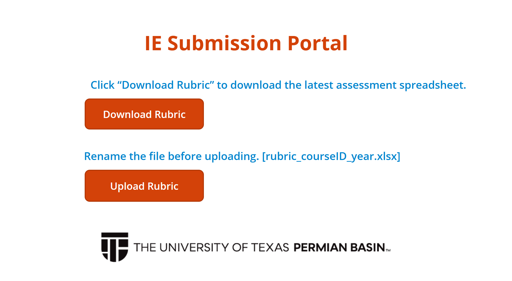
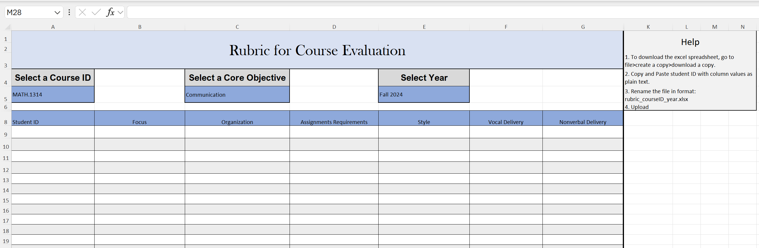
Here’s how it works: Professors visit the portal and scroll down to download the latest rubric. This Excel template is intelligently designed with dropdowns for course and core objective, and based on the selected objective, the corresponding evaluation columns auto-update. Professors then enter student data row by row, rename the file to a format like rubric_math1314_2024.xlsx, and upload it through a PowerApps form.

Behind the scenes, Power Automate takes over—grabbing the uploaded file, storing it in the correct SharePoint folder, and prepping it for ingestion by Power BI. On the next scheduled refresh, the dashboard automatically categorizes each row of data into one of six core objective tables using Power Query logic. No matter the course or year, all submissions land in the correct place inside the Power BI model, fully parsed and ready for analysis.

The result? Admins no longer chase down files. Professors don’t need to email anyone. Dr. Collins doesn’t have to merge spreadsheets or manually clean up inconsistent data. And Dr. Edward? He simply opens the dashboard, refreshes the semantic model, and sees the updated reports—categorized, summarized, and beautifully visualized.

The hardest part? Designing the system from scratch. From structuring a flexible Excel template that adapts to any core objective, to building a dashboard that interprets uploads from an entire department, to writing a Power Automate flow that moves files invisibly—every step demanded custom thinking. Even PowerApps required a clever workaround to allow file attachments from a list, and then delete the placeholder record after saving the file to SharePoint.

What makes this system special isn’t just the automation—it’s the architecture. Every file follows a naming convention. Every submission flows through a predefined pipeline. And every update lands in a central, standardized data model. If all rubric files are uploaded correctly, the entire ecosystem runs on its own.

This is more than a tool—it’s an institution-grade solution built for clarity, scalability, and autonomy. And the best part? Once it's set up, there's nothing left to do but watch it run.

Excel, Power BI, PowerApps, Power Automate, Power Query, SharePoint, Workflow Automation, Institutional Reporting

Dashboard Preview (PDF)

PowerApps Upload Portal

PowerApp Screenshot

Dynamic Excel Rubric Template

Rubric Screenshot

MasterList 2.0 — Power BI Dashboard for Institutional Reporting

MasterList 2.0 is a dynamic Power BI dashboard I developed during my Institutional Research internship at UTPB. It manages and visualizes survey submissions across all university departments, providing real-time insights into open, closed, and pending reports categorized by status, timeline, department, and submission type.

The dashboard integrates data from Excel, SQL, and SharePoint to automate updates and maintain a centralized view of institutional reporting activity. Executives can monitor compliance, deadlines, and workflow progress without manual tracking or spreadsheet merging.

One of the most intuitive and powerful features of this dashboard is the monthly report interaction. Users can click on a specific month in the bar chart to highlight their area of interest. Once a month is selected, a "View Reports for This Month" button becomes active. Clicking this button performs two key actions:
  • It dynamically changes the title of the Power BI page to say: “Reports for the month of [Selected Month]”, ensuring clarity of context.
  • It navigates to a new page that displays a fully filtered, interactive table showing only the reports to be submitted for that selected month.
This interaction design not only improves the user experience, but also ensures that stakeholders can quickly drill down into specific timeframes with confidence and clarity. The report table includes detailed metadata such as task rank, department, close/open dates, and approval status—all immediately filtered and accessible.

MasterList 2.0 isn’t just a dashboard—it’s a complete operational tool that supports planning, compliance tracking, and institutional effectiveness. It reduces human error, removes data redundancy, and presents insights in a way that empowers users at every level of the university.

Power BI, Excel, SQL, Power Query, SharePoint, Institutional Research, Workflow Automation

Research Paper

EvolveAgent — A Game-Based Tool for Teaching Genetic Algorithms

Authors: Dhimant Adhikari, Dr. Priyanka Kumar
Institution: University of Texas Permian Basin

EvolveAgent is an interactive educational tool designed to teach Genetic Algorithms (GA) to K-12 students through an engaging, game-based simulation. Built with Python and Pygame, it visualizes the evolution of agent populations using selection, crossover, and mutation mechanics. Students can experiment with adjustable parameters and see real-time evolution in action, making core AI concepts more accessible. The project was presented as a research paper and demonstration at UTPB, highlighting its contribution to AI education.

Python, Pygame, Genetic Algorithms, Game Simulation, Research Paper, AI Education

Academic Projects

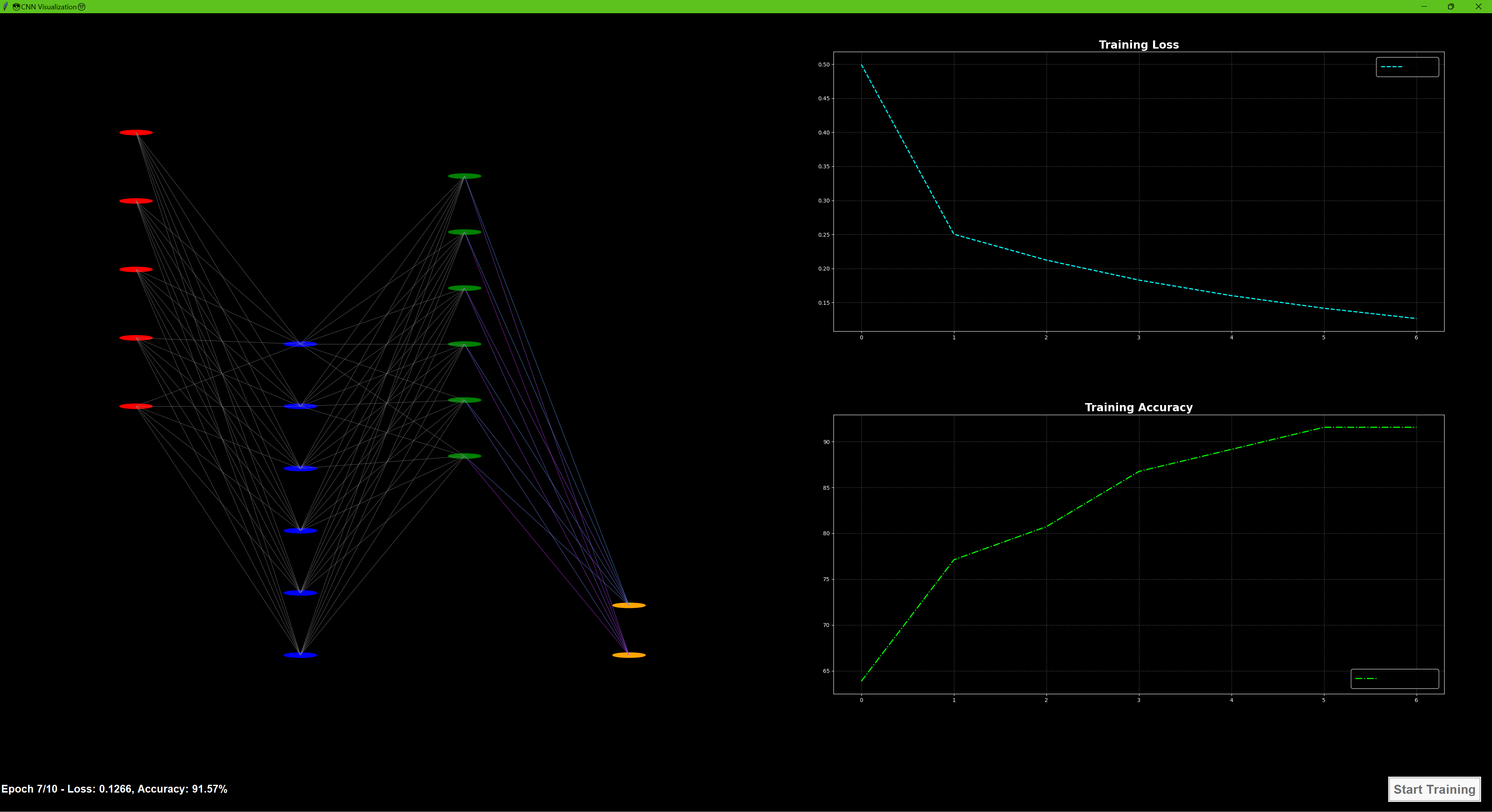
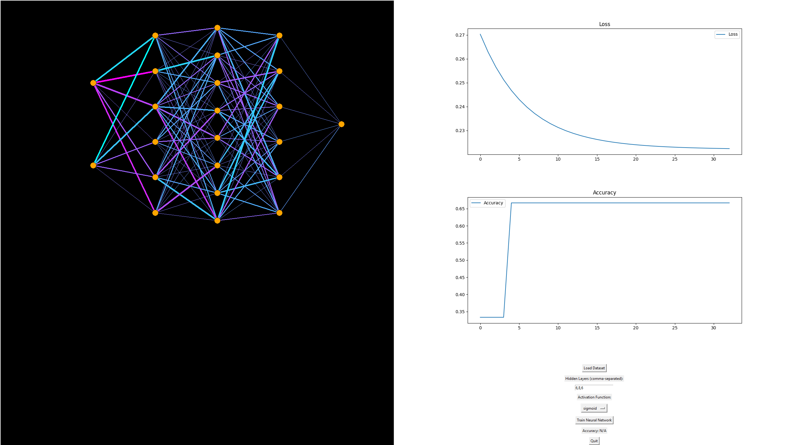
Convolutional Neural Network Visualization

This project implements a Convolutional Neural Network (CNN) to classify images into two categories: Glasses and No-Glasses. It includes a real-time visualization using a Tkinter-based GUI, which:
  • Displays the CNN structure: Input, Convolutional, Pooling, and Fully Connected layers.
  • Shows real-time training metrics: Loss and Accuracy.
  • Highlights dynamic weight updates through color-coded connections.
The project employs Leaky ReLU activation, He initialization for filters, and gradient clipping to stabilize training. It demonstrates CNN training from scratch with an interactive and visual approach.

Python 3.x, Tkinter, NumPy, Matplotlib, Scikit-Learn, PIL (Pillow), Convolutional Neural Networks, Visualization

CNN Visualizer Screenshot

Multi-Level Game Engine — Real-Time Java Platformer

This project is a 2D multi-level game engine built in Java that features real-time physics, and platform mechanics. Developed from scratch using Java, the engine supports modular level design, enemy spawning, and dynamic interactions such as moving platforms, projectile traps, and boss fights.

The core architecture includes a custom GameWindow and GameLoop to manage rendering and ticks per second. Each level is loaded from its own blueprint. The physics system supports gravity, velocity, and collision detection, creating smooth and responsive gameplay.

This game showcases object-oriented architecture, modular design, and efficient rendering techniques using Java’s native libraries.

Java, OOP, Game Development, Real-Time Physics, Collision Detection, Level Design

Neural Network Visualizer & Trainer

This is a fully interactive, animated neural network visualizer built with Python and Tkinter. It allows users to define custom architectures, train on datasets like XOR or CSVs, and watch the learning process unfold in real time.

Key features include:
  • Custom architecture configuration (input, hidden layers, output)
  • Live updates of weights using animated, color-coded lines
  • Neuron glow and activation-based color intensity
  • Support for ReLU and Softmax functions with proper loss tracking
  • Displays prediction values near output neurons after training
Internally, this project uses a multi-threaded training loop with a visual update callback. It handles softmax classification for multi-class output, and includes dynamic calculation of loss (cross-entropy) and per-epoch visualization refresh. It’s an ideal project for those learning how forward/backward propagation actually works—because you can see every connection evolve.

Python, Tkinter, NumPy, Matplotlib, Multithreading, Neural Networks, Data Visualization

CNN Visualizer Screenshot

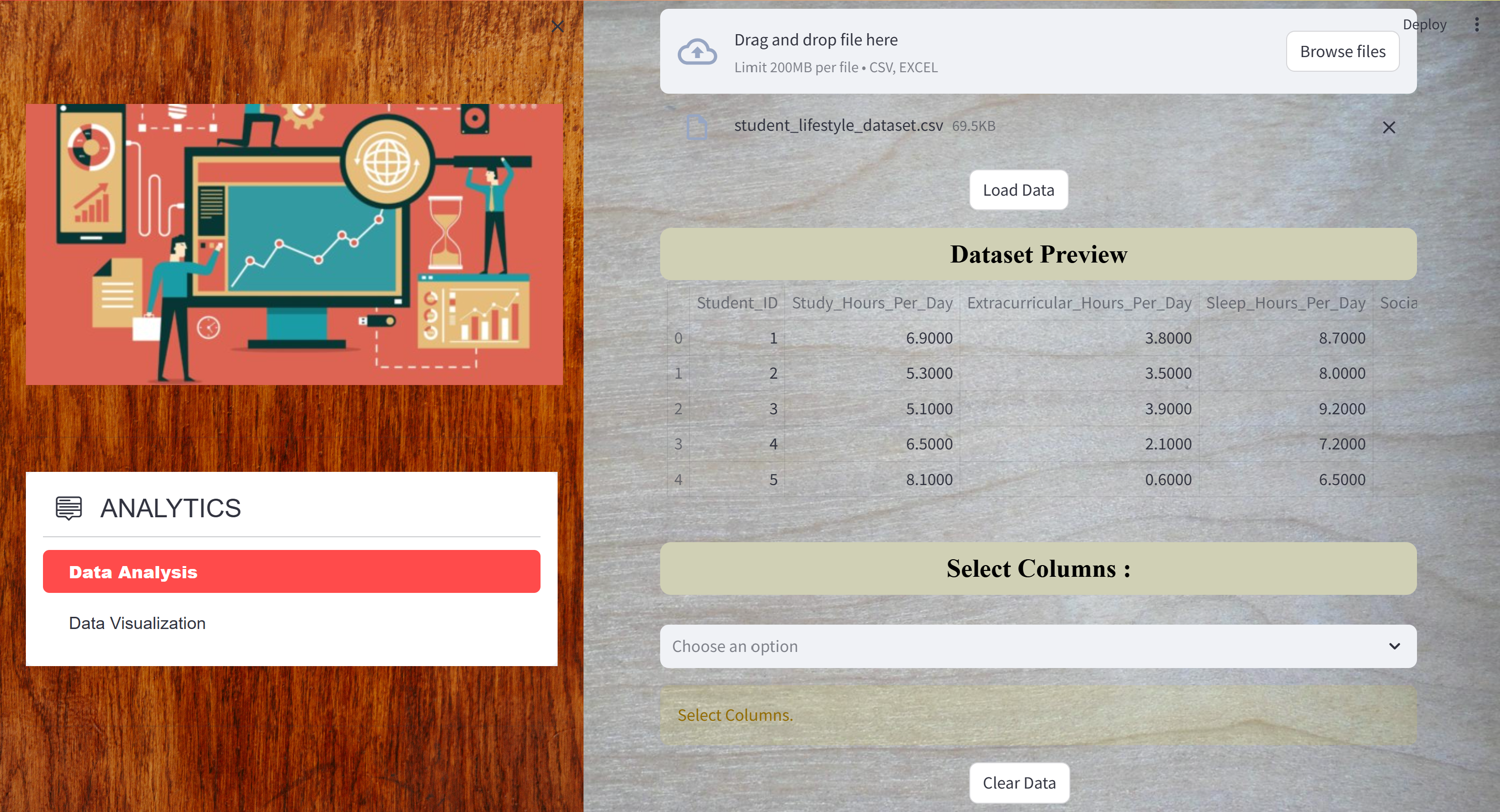
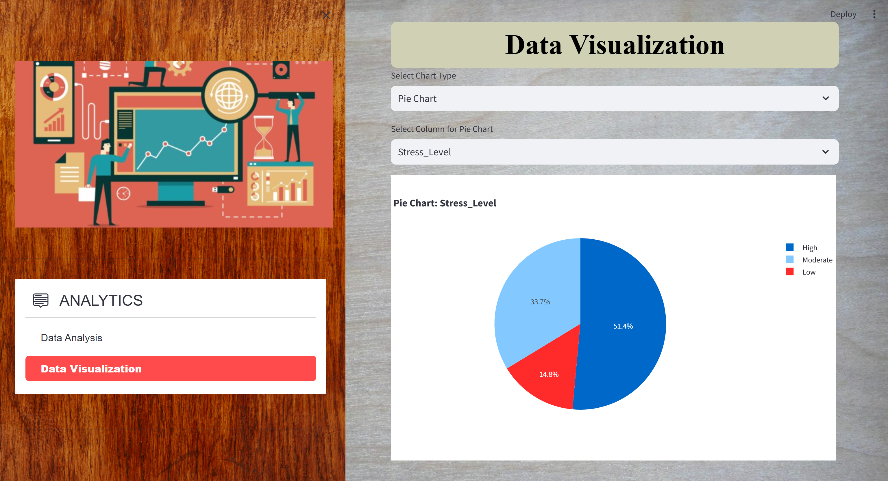
Comprehensive Data Analytics Project

This project undertakes a thorough analysis of the Titanic disaster to explore the relationship between passenger demographics—specifically class and age—and survival outcomes. Utilizing SQL for efficient data extraction and management, the project ensures the precise retrieval of key data subsets from the Titanic dataset. The data is then processed, cleaned, and prepared using Python, with extensive use of Pandas for manipulation and aggregation. The project employs statistical analysis to examine survival rates across different passenger classes and age groups, revealing that First-Class passengers had nearly three times the survival rate of those in Third Class. This finding underscores the critical role of socioeconomic status in survival chances. The analysis also delves into age distribution, identifying that children in Second Class had a 100% survival rate, compared to 80% in First Class and 40% in Third Class, while seniors, particularly those in lower classes, had the lowest survival rates. Visualization techniques, powered by Matplotlib and Seaborn, effectively highlight these trends and correlations, providing clear, data-driven insights. Additionally, an interactive Tableau dashboard is developed to allow for intuitive exploration of the data, making the complex analysis accessible to a broader audience. The project concludes with recommendations for reducing class disparities in survival rates, improving emergency protocols, and incorporating these insights into the design of future maritime safety measures. This comprehensive approach not only demonstrates technical proficiency in data analytics but also provides valuable real-world applications for enhancing passenger safety.
Python 3.x, Pandas, Matplotlib, Seaborn,SQL(SQLite, MySQL, or any preferred SQL database), Tableau(for dashboard creation and visualization)

Data Analytics — A Web Application for Data Analysis and Visualization

Data Analytics is a comprehensive web application designed to streamline the process of data analysis and visualization in a user-friendly environment. The application allows users to securely upload data files in various formats, perform in-depth data analysis, and generate insightful visualizations. The platform integrates advanced features such as AI-driven previews that automatically generate initial visualizations, helping users to quickly identify patterns and trends within their data. With robust user authentication, SAD Analytics ensures data privacy and access control, making it suitable for both individual and collaborative data analysis tasks. The web application offers a responsive design, ensuring seamless access and usability across different devices and screen sizes. It supports a wide range of data analysis tasks including summarization, aggregation, and statistical calculations, all of which are powered by a backend built with Node.js and Streamlit. Users can interact with the generated visualizations, with options to zoom, download, and customize the visual output to suit their analysis needs. The integration of AI frameworks like Sklearn enhances the data analysis process by providing automated insights and suggestions, making the platform not only powerful but also intuitive for users at any level of technical expertise.
Python, Node.js, Express.js, Streamlit, SQLite3, Sklearn, Matplotlib, Pandas, Plotly, Seaborn

Data Analysis

Data Visualization

World Cup 2014 Data Analysis with Java and MongoDB

This project leverages the power of Java and MongoDB to perform an in-depth analysis of the World Cup 2014 dataset. The application connects to a MongoDB database, executing complex queries to extract and analyze data about countries, matches, players, and stadiums. The results, such as a list of World Cup-winning countries, the number of trophies each country has won, and the capitals of countries with large populations, are systematically outputted to a text file for easy review. Additionally, the project delves into more nuanced queries, like identifying stadiums that hosted high-scoring matches, cities with stadiums named "Estadio," and players over a certain height. It also provides insights into match statistics within a specific date range and detailed information about captains with notable disciplinary records and goal counts. By integrating advanced querying techniques with data aggregation and file handling, this project showcases a robust collaboration between Java and MongoDB, highlighting your ability to manage and analyze large datasets, extract meaningful insights, and present the information in a structured and accessible format.
Java, MongoDB, Data Analysis, Database Querying, Data Aggregation, File Handling

Maze-Solver-in-Python-Using-BFS-and-Curses

This Python application is designed to solve and visualize the solution to a maze using the Breadth-First Search (BFS) algorithm. The maze is represented as a 2D grid, where the walls are denoted by #, the starting point by O, and the destination by X. The application leverages the curses library to create a dynamic, text-based interface that visually displays the maze and the pathfinding process as it unfolds. Real-Time Path Visualization: The application visually traces the BFS algorithm’s progress through the maze, providing a clear and interactive demonstration of pathfinding. Color Coding: The maze is color-coded with walls and open paths in blue, while the discovered path is highlighted in red, making it easy to follow the solution. Robust Search Logic: The BFS algorithm ensures that the shortest path is always found, regardless of the maze's complexity.
Python, Breadth-First Search (BFS) Algorithm, Data Structures, curses Library, Dynamic Visualization

Server-Client-Application-Analysis-and-Monitoring-with-Shared-Libraries

This project focuses on the development and analysis of a server-client application that handles client interactions, monitors server activities, and manages shared libraries. It includes components for syscall tracing, server-side analysis, and secure user authentication using shared libraries. The application supports different modes of analysis, such as client, server, and redirect server analysis, facilitated by custom scripts for server management and library modification. The project also implements a shared library for secure password hashing and integrates a robust compilation process using a Makefile. This setup enables comprehensive testing, development, and maintenance of the server application, ensuring secure and efficient operation.
C Programming, Server-Client Architecture, Syscall Tracing, Shared Libraries, Secure Authentication, Shell Scripting, Makefile, Server Management, Password Hashing

Facebook Phishing Simulation Project

NOTE: Please find the project demonstration video attached via YouTube.

This project demonstrates a phishing attack simulation designed to educate users on cybersecurity threats, specifically phishing scams. The website mimics the Facebook login and registration forms, complete with fields for personal information such as email and password. When users enter their credentials, they are stored in a Firebase Firestore database, simulating how real attackers might harvest sensitive data. The attack begins with a phishing email titled "Settlement Information," which lures victims by suggesting they may be eligible for compensation related to a Facebook lawsuit. The email creates a sense of urgency and directs recipients to the fake login page, where their credentials are captured. The project structure includes HTML for the form, JavaScript for database interaction, and Firebase for secure data storage. This simulation, detailed in a video demonstration, serves as a powerful tool for raising awareness about the dangers of phishing and the importance of cybersecurity practices.

NOTE: This project is private on GitHub. If you're interested in accessing the repository, please request access by contacting me directly or by submitting a pull request with a justification for why you need access.


HTML, CSS, JavaScript, Firebase Firestore, Web Security, Phishing Simulation, Cybersecurity Awareness, Social Engineering, Database Integration, Ethical Hacking